Arthritis Homepage
REDESIGN
Leading the fight for the arthritis community, the Arthritis Foundation helps conquer everyday battles by providing information and resources, supporting advancements in science, and fostering community connections.
During the site redesign, the homepage had been simplified to reduce clutter, but analytics showed an increased drop-off rate. We initiated this project to explore better ways to address the needs of both first-time and returning visitors.
RESPONSIBILITIES
User Experience, User Flow, Visual Design, User Testing, Stakeholder Interviews, Front-End Development
How can we provide a guided path for homepage visitors seeking specific information or the top desired actions?
Understanding the Users
We conducted interviews with ten people to gain a better understanding of their main goals and pain points with the homepage as an entry point to the site. Overall users felt like there was not a lot of guidance on where to go for actionable information. We discovered the top 4 goals of our users; learn more about their disease, manage their pain, and get involved.
Balancing business objectives with user needs
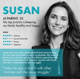
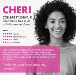
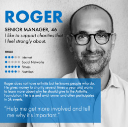
To ensure the problems we were solving for users could be aligned back to the business needs we interviewed stakeholders. We agreed on a list of the top business objectives; get users to donate, generate leads and learn more information about the visitor, get visitors involved (join an event, fundraise or volunteer), and increase awareness to create brand advocates. With these goals in mind, we organized the user feedback to see how it affected the desired outcomes. We updated our personas to provide a healthy cross-section between business objectives and user needs and guide our decision making.
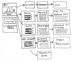
Sketching key user flows
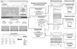
Sketching the key user flows, we focused on making it easier to get the users through the main objectives quickly and giving them more logical things to explore when they complete.
Once we’ve given them more information and/or solved their problem, we present signup opportunities to engage them further with the organization. We customized these calls to action based on what we have learned about the user in their journey so far. Even anonymous data is collected into Marketo for use later as we soft profile both anonymous and known users. If the users signup, their profile is connected with the data we collected on their journey creating a higher quality lead.
Wireframes and User Flows
Strategy and Concept
Choosing from the new help feature, popups ask users to share a little information in order to get results customized to their situation. To minimize interruption of the user’s journey, each help popup has a bypass option for those who prefer not to share any information. Collecting profile information allows us to understand our users better and present more value on the subsequent pages.
Whether a user has customized their results or not, they are taken to an informational page with detailed sections broken into digestible parts. The modular layout of these pages allows for a great deal of flexibility and easy access to high-level information as well as ample opportunities to dig deeper when desired.
Landing Page Design
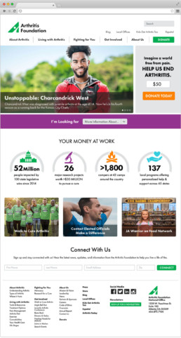
As seen in the high-fidelity designs, the reduced size of story sliders allows a more prominent donation call to action. Adding the “Get More Information” jump menu adds focus on the top user needs. The impact bar gives a few quick stats to promote organizational successes. Secondary promos create a space for featured initiatives. Finishing the page off with a quick signup opportunity simplifies signup without delaying other objectives.
Conclusion
The first month of analytics revealed substantial use of the new “Get Information” jump menu. On the popups, over 70% of users customized their results which led to increased time on site and more pages viewed. The new quick donation feature became the second highest performing donation form.
Simplifying the path to relevant information, allowed us to meet both user needs and business objectives. Users were more likely to share information when they were given an immediate value from it. Stakeholders were excited to see the results and we were engaged to customize additional user paths on other main arteries of the site.
